Guides
Slide contrast and readability before you present

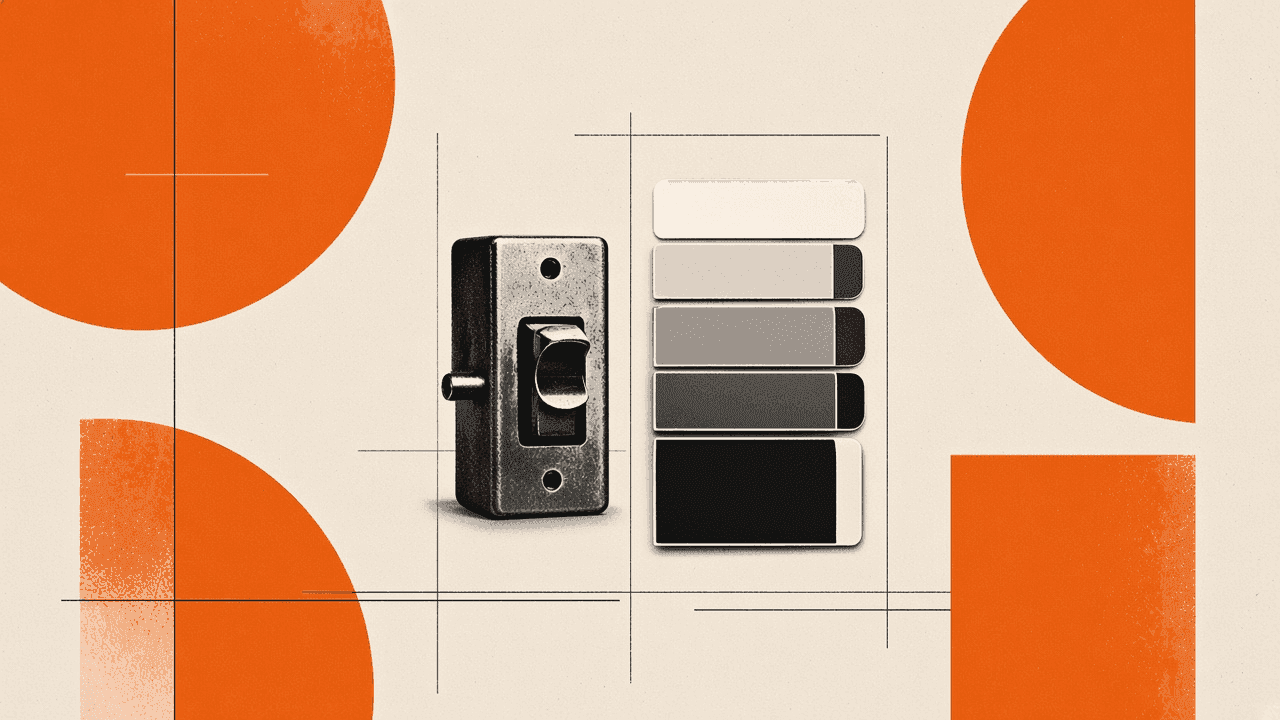
You designed slides on a bright laptop. In the room, gray body text disappears on the projector and chart labels shrink into noise. A slide contrast and readability pass catches those problems before the audience does. Export the deck as PDF, upload it for plain notes on tiny type, weak color pairs, and crowded layouts, then fix the flagged slides in your editor. Toolsy Presentation contrast checker reads the whole deck and returns a handful of tips, free with up to five checks per day. It is not a full story review; use Review presentation when messaging needs work. This check differs from the site WCAG hex contrast tool, which tests two colors you pick, not slide screenshots.
Why slides look fine on your screen but fail in the room
Laptop screens sit eighteen inches from your face with high contrast and sharp pixels. Projectors bounce light off walls, wash out mid-tones, and soften fine lines.
Zoom shares compression artifacts on small text. Room lighting varies. Viewers in the back row see less detail than you do at the podium.
Design habits that cause pain: light gray body copy, thin font weights, busy photo backgrounds behind text, and chart labels at default sizes meant for print.
Readability problems are predictable. Catching them on the PDF export beats noticing them when a client squints at slide seven.
Projectors versus monitors
Projectors lose shadow detail. Dark gray on black becomes one blob. Yellow on white nearly vanishes.
Safe pairs for rooms: dark text on light backgrounds or white text on saturated dark blocks with large type. Avoid mid-gray on light gray for body copy.
Test one slide fullscreen on the actual display when you can. Software checks still help when rehearsal space is unavailable.
Webinar compression and small UI text
Screen shares re-encode slides. Text under 18 pt often blurs in webinar mode even when PDF looked crisp locally.
Increase label sizes on charts before the webinar. Hide browser chrome and zoom the slide app so attendees see fewer pixels wasted on toolbars.
What to check by eye before you upload
Walk the deck once in PDF at 100% zoom without editing. Mark slides where you lean forward to read.
Look for paragraphs pasted onto slides. Slides should carry headlines and cues; paragraphs belong in notes or handouts.
Check color-blind risk on key charts. Do not rely on red-green alone for critical differences; add labels or patterns.
Confirm contrast on your title slide. If the logo sits on a photo, add a solid scrim behind text.
Font size and weight habits
Aim for 24 pt or larger for body bullets in live rooms. Footnotes and source lines need at least 18 pt if they must stay on screen.
Thin weights (light, hairline) fail on cheap projectors. Use regular or semibold for text people must read quickly.
Cap bullets at six lines per slide. More lines push font sizes down and guarantee unreadability.
Backgrounds that eat text
Full-bleed photos behind bullets rarely work without a dark overlay. Template gradients with low contrast look trendy on Dribbble and fail in conference halls.
Move busy images to half the slide with a solid text panel on the other half. Your eyes adjust; audiences will not work that hard.
Export slides as PDF for a contrast check
Save or export from PowerPoint, Keynote, or Google Slides to PDF. PDF captures what the room will see more faithfully than uploading PPTX alone.
Include only slides you will show. Appendix pages with tiny tables may trigger flags you do not need to fix before a short talk.
Keep file size reasonable for upload. Compress embedded photos inside the slide app if the PDF is huge.
Open the PDF locally once. Confirm fonts embedded correctly and nothing clipped at edges.
PowerPoint and Google Slides export tips
In PowerPoint, use File → Save As → PDF, not "Print to PDF" through a driver unless that is your only option. Check "Standard" quality for mixed photo slides.
In Google Slides, File → Download → PDF. Wait for download completion before upload; partial files cause empty reviews.
Animations do not export to static PDF; that is fine for readability review. Build slides as static readable frames.
Run the presentation contrast checker
Upload the PDF to deck-contrast. The tool flags hard-to-read slides: low contrast text, small fonts, gray-on-gray pairs, crowded layouts.
Expect three to five short notes, not a long accessibility audit. Fix the worst slide first, re-export, and upload again if time allows.
Free accounts get up to five contrast checks per day on this tool category. Pro removes daily caps on paid tiers where applicable for other tools; contrast checks stay in the deck tool bucket at five per day on free per product FAQ.
This tool reads slide content contextually. The separate WCAG contrast checker on Toolsy tests two hex colors for ratio math, not whole decks.
How to apply fixes without redesigning the whole deck
Darken body text one step on flagged slides. Swap light gray #888 styles to near-black #222 on white.
Increase chart label font size globally if multiple slides flag labels. One template fix beats ten one-off edits.
Remove duplicate bullets and send detail to speaker notes. Less text allows larger type.
Pair readability with story and timing review
Contrast checks do not fix weak narrative. After readability passes, run Review presentation for flow and ask clarity before a client pitch.
Use Presentation timing to confirm the shortened, larger-type deck still fits the slot. Readable slides with too many of them still overrun the meeting.
For pitch prep workflow, see get feedback on slides before a client pitch for the full checklist order.
When a human designer still helps
Brand teams may need template updates if every deck flags gray body styles. Software notes justify a ticket to design ops with examples.
Complex data visuals may need redesign, not just bigger labels. A contrast check tells you the symptom; a designer fixes the chart grammar.
Limits, privacy, and what this tool does not do
Presentation contrast checker does not replace WCAG compliance testing for your website. It helps live slide readability.
It does not rewrite slide copy or reorder your story. Pair with presentation review for messaging.
Uploads process to return notes; read is it safe to upload documents online and what happens to files after processing for confidential decks.
Five free checks per day per deck-contrast tool means plan batch reviews before rehearsal day, not five minutes before stage time only.
Frequently asked questions
What is a slide contrast checker for presentations?
It reviews an exported slide deck PDF and notes readability problems like low contrast text, small fonts, and crowded layouts. It helps presenters fix slides before projectors and webinars expose weak design. It is not the same as a two-color WCAG ratio calculator.
Is presentation contrast checker free on Toolsy?
Yes. You get up to five checks per day on the deck contrast tool without a subscription. Pro affects other product limits; see the tool page for current caps. Each PDF upload counts as one check.
Which file format should I upload for slide contrast check?
PDF exports work best. You can upload a slide image for a single frame check. For PowerPoint files, save as PDF first so fonts and layout match what the room will see.
How is slide contrast checker different from WCAG contrast checker?
The WCAG tool on Toolsy tests hex color pairs for ratio compliance you choose manually. Presentation contrast checker reads whole slide decks and comments on readability in context, including font size and clutter on charts.
What slide colors are readable in a conference room?
Dark text on light backgrounds or large light text on dark solid panels usually survive projectors. Avoid mid-gray body copy on white and yellow on white. Increase weight and size before chasing exotic palettes.
Can a slide contrast checker fix my PowerPoint file automatically?
No. You get notes; you apply fixes in PowerPoint, Keynote, Google Slides, or your design app. Re-export PDF and optionally check again within your daily limit.
How small is too small for slide body text?
If you would squint at 100% zoom on a laptop, the back row will struggle. Many rooms need 24 pt or larger for bullet body text. Chart labels often need manual enlargement beyond defaults.
Should I run contrast check before or after presentation review?
Run contrast first when projector readability is the main worry. Run presentation review first when the story and ask are weak. For client pitches, many teams contrast-check the PDF, then run full review on the same export.
Does slide contrast checker work for Google Slides?
Yes after you download PDF. The checker reads the exported pages, not the live Google link. Verify charts survived export before upload.
How many contrast checks can I run per day?
On Toolsy free tier, deck contrast allows up to five checks per day for that tool. Batch your exports before rehearsal day. Upgrade paths on other tools do not turn this into unlimited checks unless product copy changes; check the live FAQ on the tool page.
After readability passes, get feedback on slides before a client pitch when the deck must sell, not just display. When rehearsal time is fixed, pair contrast fixes with fit your presentation to 10 minutes. For UI button color ratios (WCAG AA), use Contrast checker for WCAG AA buttons instead of this slide-readability tool.
Check slide readability
Upload a PDF for short notes on contrast, text size, and clutter. Free with up to 5 checks per day.