Guides
QR codes with logo: contrast and scan reliability
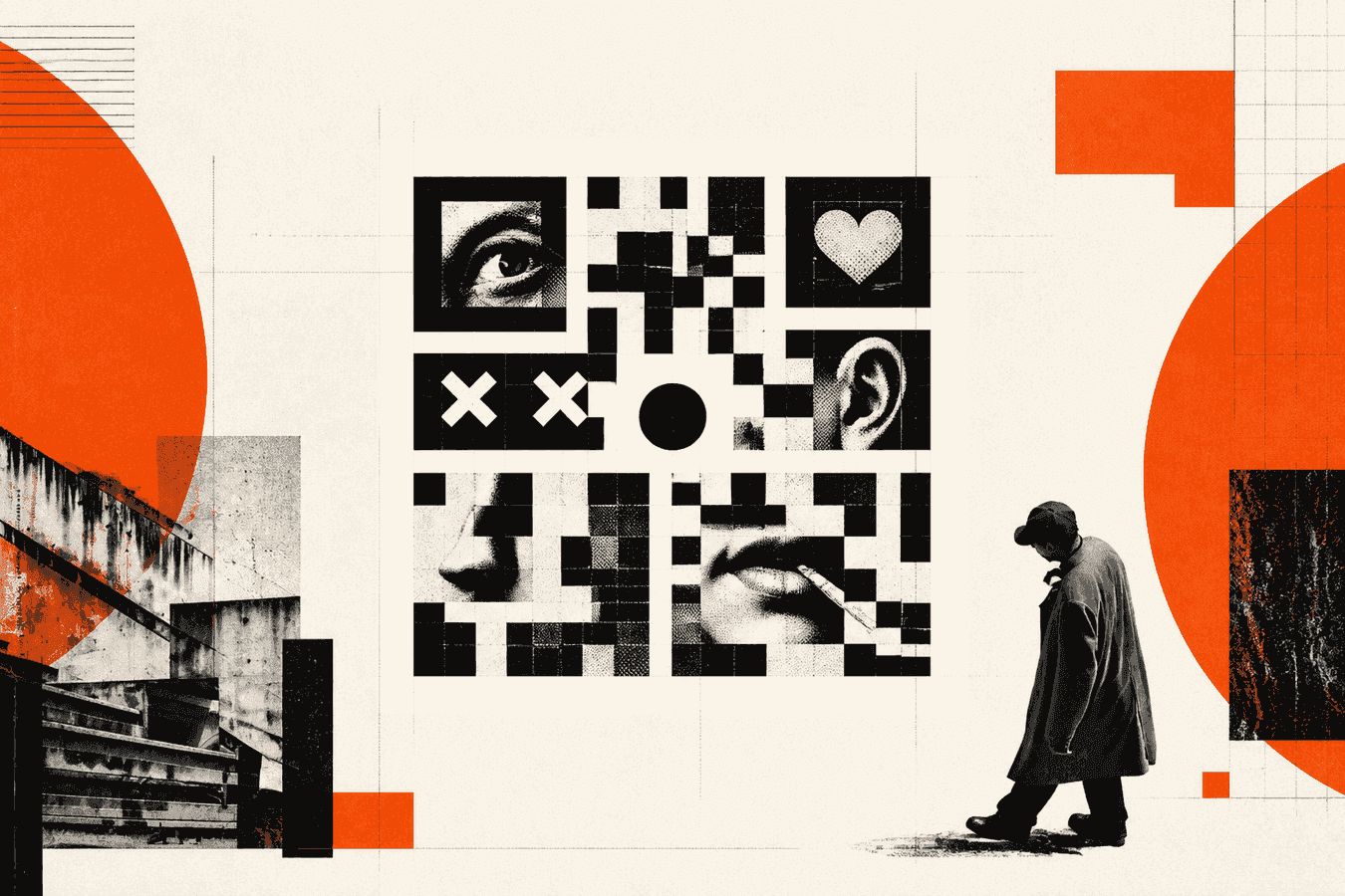
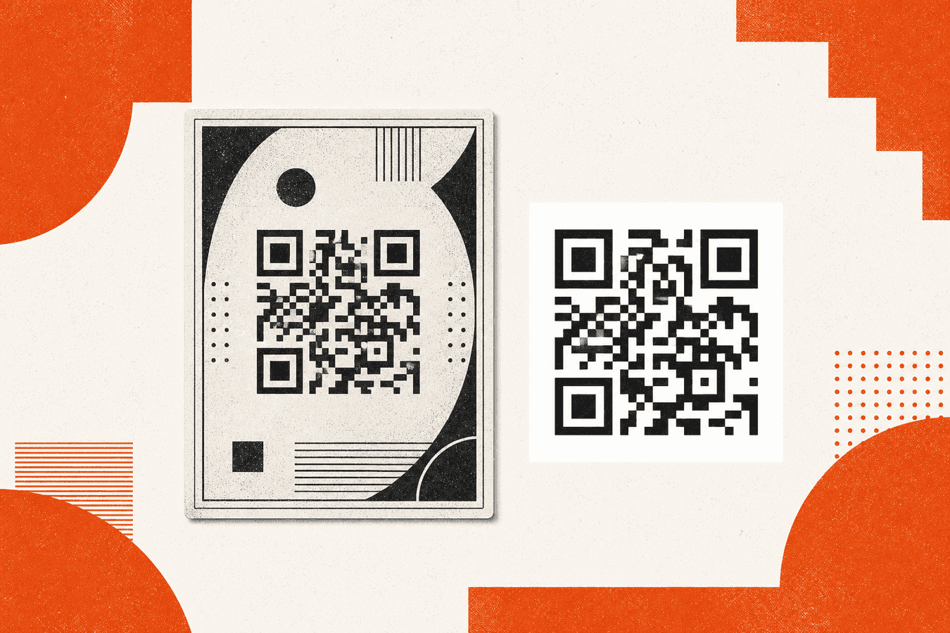
A qr code with logo works when the logo covers only a small center patch and the rest of the square stays dark modules on a light ground. Phones recover damaged modules with error correction, so a modest mark can survive. A large badge, a pale fill, a covered finder square, or a missing white margin will not. Build a clean code first with the QR code generator, place the logo in design software, then prove the final file with a phone camera and QR diagnose before you print a batch. Treat a desk-monitor scan as a draft check only; print light and a second phone are the real gate.
Why logos break QR scans
QR codes store data in a grid of dark and light modules. Cameras find the three large corner squares (finders), sample the grid, then decode. A logo is just ink or pixels sitting on top of that grid. When the mark hides too many modules, or flattens contrast, the camera never gets a clean sample.
Design tools invite oversized center marks, brand-color fills, and busy backgrounds. Those choices look sharp on a laptop. On a phone in a shop window, glare and distance remove the margin of error you thought you had.
Error correction buys you a budget of recoverable damage. It does not forgive covered finders, a logo that spans most of the square, or dark modules printed on a dark poster. Treat the logo as optional decoration after the code already scans plain.
If you already printed a weak branded code, fix the file and reprint. Lighting tricks help for one demo. They do not fix a batch of posters.
Contrast rules for a qr code with logo
Start with dark modules on a light field. Black on white remains the safest pair. Dark navy on off-white can work when the gap in lightness stays large. Light gray on white, brand orange on brand red, or white modules on a photo background fail often.
The logo itself needs a clear edge against the modules under and around it. A translucent PNG that lets gray modules show through the mark can confuse edge detection. Prefer an opaque mark with a thin light pad under it if the logo is dark.
Colored QR modules are a separate risk from logos. A colored qr code can still scan when dark modules stay dark and light modules stay light. Pastel “brand” fills that sit in the middle of that range cut reliability for no gain.
Print adds another contrast hit. Cheap toner, recycled stock, and window vinyl all dull blacks. Leave headroom: if the screen proof is only “okay,” print will be worse.
Dark on light beats brand color fills
Pick module colors for the camera, not for the brand deck. Keep modules near black. Keep the background near white. Put brand color in the logo mark or in the surrounding layout, not in the module field.
If marketing insists on colored modules, test on two phones under the light you will use in the wild before you print. Reject any pair that needs perfect framing or max brightness to open.
Transparent and low-contrast logos
A white logo on pale modules disappears. A black logo on black modules merges into a blot. Either case wastes error correction without helping the brand read.
Export the logo as opaque PNG or SVG. Give it a small white or cream square behind the mark so the eye and the camera see a stable island. Keep that island well inside the center of the code.
Error correction and how much damage a logo can cover
QR symbols use Reed-Solomon error correction at four levels: L, M, Q, and H. Recovery budgets for damaged modules sit near 7%, 15%, 25%, and 30%. Higher levels store less payload in the same version, so long URLs push you toward denser grids when you raise the level.
A logo punches a hole in the center. That hole is deliberate damage. Raise error correction when you plan to brand the code. Many generators default to M. H is the usual target for a small center mark.
Toolsy’s free QR code generator builds a sharp black-on-white code in your browser (default level M) and downloads PNG or SVG. It does not upload a logo for you. Generate the base, then place the mark in your layout tool with H-level output if your design stack can set the level. If you cannot raise the level, keep the logo smaller.
Long tracking URLs make dense codes. Dense codes leave less visual room for a mark. Shorten the link, use a short redirect you control, or drop UTM noise from the printed square when scans matter more than analytics on the URL itself.
Levels L, M, Q, and H in practice
Use L only for temporary screen codes with no logo and perfect contrast. M fits plain print without branding. Q and H are the practical bands when a logo sits in the middle.
Do not assume “H means any logo size.” H recovers about thirty percent of modules. A mark that covers half the symbol still loses.
Payload length vs logo budget
Every extra character can bump version size and shrink module size at a fixed print width. A short HTTPS link plus a tiny logo beats a paragraph of query string under a large badge.
If you need editable destinations later, that is a different product job (Dynamic QR on Pro). Branding rules stay the same: small center mark, high contrast, intact finders.
Logo size, placement, and finder squares
Keep the logo in the center. Leave the three finder squares at the corners clear and whole. Covering a finder is a common reason phones refuse the code while a desktop decoder still “sort of” works on a crop.
A practical size range for many marketing codes is about 10-20% of the symbol width for the logo’s bounding box, including any white pad. Start near 10-15%. Grow only after two phones read the file from a printed proof.
Do not stretch the logo into a wide banner across the middle. Do not put secondary icons in the corners “for balance.” Finders and timing patterns live there.
Round logos often sit cleaner than wide wordmarks. If the wordmark is long, use the icon mark in the QR and put the full name beside the code on the page.
Center placement only
Center is where error correction is most forgiving for a compact blot. Edge and corner marks collide with finders and format information. Skip creative placements that sit on those regions.
Align the mark to the visual center of the module grid, not to a cropped artboard that already cut the quiet zone.
Leave finders and the quiet zone alone
The quiet zone is the light margin around the whole square. Crowding the code with frames, stickers, or text that touch the modules removes the border cameras expect. Keep at least four modules of clear light space on every side; more is safer on print.
Frames belong outside that margin. If you want a colored border, put it beyond the quiet zone, not on top of the outer modules.
How to add a logo without guessing
- Create the destination URL and open the QR code generator.
- Download SVG for print or a large PNG for screens.
- Place the file on a white artboard in your design tool.
- Drop a small opaque logo in the center with a light pad if needed.
- Export the final flat PNG or PDF at the size you will print.
- Scan with your phone camera. Scan again with a second phone.
- Run the export through QR diagnose for contrast and quiet-zone warnings.
If step 6 fails, shrink the logo before you change brand colors. Size is the first lever. Contrast is the second. Error correction level is the third when your toolchain exposes it.
For posters, print a single sheet at final size and walk across the room. Distance and glare matter more than a perfect desk scan.
When you photograph a printed proof to share with a teammate, strip location metadata if the sheet sits somewhere private. See Remove EXIF GPS before sharing photos.
Test on a phone before you print a batch
A monitor scan is a weak test. Cameras on phones use different focus, HDR, and QR parsers than your laptop webcam. Bank apps and in-app scanners can be stricter than the system Camera app.
Test the final branded file, not the plain code from before the logo. Test indoors and near a window if the piece will hang in mixed light. Test at the distance guests will stand.
If the code opens on one phone and fails on another, treat that as a fail. Shrink the logo, restore contrast, and retest. Do not ship “works on my iPhone.”
QR diagnose runs on your device. It checks decode, contrast, quiet zone, and size tips. Use it after branding. It is not a substitute for a live camera pass on paper.
For wider won’t-scan issues (blur, glare, damaged stickers, wrong app), use the QR code won't scan checklist and QR diagnose on the final export, then retest on paper with two phones.
When to skip the logo
Skip branding when the print is tiny (badges, bottle caps, crowded menus), when the payload is already dense, or when the surface is reflective metal or textured kraft that kills contrast. A plain high-contrast code that opens beats a pretty code that guests abandon.
Packaging and outdoor vinyl need larger modules and stricter quiet zones. Logos compete with that budget. Prefer a logo beside the code on the package panel.
If you only need a free generator with no account friction, read the no-signup checklist when it ships (Free QR generator without account). Logo reliability still follows the rules above.
Uploads for diagnose and generator work stay on your device for these tools. For a wider trust view of browser processing, see Is it safe to upload documents online?.
Frequently asked questions
Can I make a qr code with logo that still scans?
Yes, when the logo stays small, centered, and opaque on a high-contrast grid with intact finder squares. Raise error correction toward H when your tools allow it, and keep a clear quiet zone. Always confirm with two phones on the final file before a print run.
How large can the logo be on a QR code?
Most reliable branded codes keep the logo (plus any white pad) near 10-20% of the code width, often closer to 10-15% until tests pass. Bigger marks burn error-correction budget and start to hit finders or timing patterns. If a phone fails, shrink the mark before you change anything else.
What error correction level should I use with a logo?
H is the practical target for a small center logo. M is fine for plain codes with no mark. L leaves little room for damage once you cover modules. Remember that higher levels reduce how much data fits in the same version, so shorten long URLs when you raise the level.
Does a colored qr code with a logo still work?
It can, if dark modules stay dark, light modules stay light, and the logo does not sit in a mid-tone mush. Brand-color module fills that look stylish on a mockup often fail under glare. Prefer black modules, white ground, and brand color only in the logo or the surrounding layout.
Why does my branded QR work on screen but not in print?
Screens are bright and sharp; print adds ink spread, paper texture, and weaker blacks. A logo that passed on a monitor with little margin can fail on matte stock or vinyl. Print one proof at final size, scan from standing distance, then adjust size and contrast.
Should the logo cover the center of the QR code?
Yes for placement: center is the region that tolerates a compact blot best. No for size: covering a large share of the center still breaks decode. Never cover the three corner finders. Keep text, frames, and stickers out of the quiet zone around the whole square.
Can Toolsy’s QR code generator add my logo for me?
The free QR code generator builds a clean black-on-white code and lets you download PNG or SVG on your device. It does not include a logo upload step. Generate the base there, place a small mark in your design tool, then verify with a phone and QR diagnose.
How do I check contrast after I add a logo?
Scan with two phone cameras first. Then upload or open the final image in QR diagnose for contrast and quiet-zone hints. If contrast warns, return to dark modules on a light field and make the logo opaque. Do not rely on a single successful desk scan.
Is a branded qr code better for marketing than a plain one?
A recognizable mark can raise trust when guests already know the brand. It never beats scan success. If the choice is a plain code that opens versus a branded code that fails outdoors, ship the plain code and put the logo beside it on the flyer.
What if my qr code won’t scan after I add a company logo?
Shrink the logo, restore black-on-white contrast, confirm finders are clear, and keep a light quiet zone. Retest on two phones and with QR diagnose. For blur, glare, size, and damaged stickers, follow the won't-scan checklist.
For guest Wi‑Fi sheets, vCard cards, and dynamic versus static marketing codes, watch the other Wave 5 QR guides as they publish. Start every branded job from a clean file in the QR code generator, then prove the logo version before you print.
Make a clean QR first
Paste your link, download PNG or SVG, then place a small logo only after you have a sharp base code. Built on your device.